
Thursday, December 9, 2010
Grid
Scale


Monday, November 22, 2010


Saturday, November 20, 2010
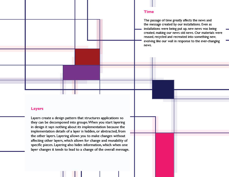
Layers by Time

Tuesday, November 2, 2010


Wednesday, October 20, 2010


Wednesday, October 13, 2010
Massage


Massage..Whistle while you work..
The main goal of this project is to find a corner that needs some sort of message sign using only type, lines and dots. The corner I chose is a the inside wall of my apartment, its been white since the day I moved and it was about time to do something to it. This corner is my working area/dinning room.
Entering the apartment the first thing you see the shiny whistle, the stencil dots that leads your eye to the other side of the wall, I have used different textures and typefaces to capture the sign… metal and a swirling type, solid paint for the rest of the sign to show how important it is to do the work but enjoy it as well.


Monday, October 4, 2010
Laws of Simplicity
About the Author…
Graphic designer, visual artists, and computer scientist John Maeda is president of the Rhode Island School of Design and founder of the Simplicity consortium at the MIT Media Lab.
In his book The Laws of Simplicity, outlines ten laws that can be used for balancing simplicity and complexity in business, technology, and design.
Law 1 REDUCE The simplest way to achieve simplicity is through reduction
He started with reduction a guideline for needing less but expecting more. The first chapter is applicable to software design the integrated circuit (IC) chip technology-commonly referred to as “ Computer Chips”- He offered to work with what he called the law of SHE method, Shrink, Hide, Embody. Small devices seems simpler to use because of how it is designed on the surface, there’s just no enough spaces and you think it cannot contain much complexity due to the size.
But all of these simple devices have hidden functions to it, and that brings us to the second method HIDE, which remains concealed inside, and he talked about the computer screen as an example where the screen hides a lot of stuff in its software. The computer has an infinite amount of capacity to hide in order to create the illusion of simplicity.
As he reached to the third method EMBODY where is it more of a business decision not a technical one. He explains how consumers buy smaller and simpler devises if they feel they are powerful enough.
“ The simplest way to achieve simplicity is through thoughtful Reduction “
Thursday, September 30, 2010
Points and lines


This Composition was created from lines, and points, both of them were photographed from different angle to get an interesting composition. The narrative of the story in the line photograph changed from the original composition. I wanted to create identical looking lines with a slight different in the movement, but now it looks like an abstract of piano chords, or stairs. As for the points the photograph gave it an interesting feel and look to it.
Sunday, September 26, 2010
Craft


wataru Itou, a young art student spent over 4 years on this paper crafted city named "Castle on the Ocean".
Figure/ground, Grid, Message

Figure draw the attention where the shapes of the ground tend to be ignored. The above figure/ground is done by Roger Shepard. If you looked closely to the white space between the columns you would find human figures.

Ray Johnson's early painting "Calm Center", he added random grids of stripes, squares and different combination of colors, using the black square as the calming center point.

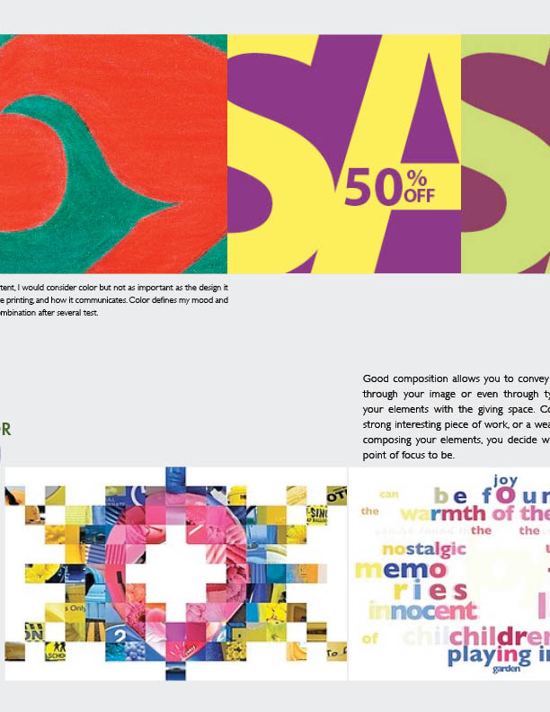
About Composition
Good composition allows you to convey a message and emotion through your image or even through type. It's about arranging your elements with the giving space. Composition can create a strong interesting piece of work, or a weak and confused piece. In composing your elements, you decide what you want your main point of focus to be.
You all can see the same thing or you could choose different point in interest.
You all can see the same thing or you could choose different point in interest.
Wednesday, September 22, 2010


Composition Observation

To determine the focal point of your design, first ask yourself, “What do I wish to say?” The answer to this question will establish the focus of your design. Once you’ve determined the focal point you need to decide its position. You don’t want your viewers to ignore the rest of the design, so your focal point should be placed in such a way that the viewer’s eye is led into the entire design, rather than focusing only on one part of your it. You can lead the eye using curving lines, light and dark colors and other different elements.
In this book cover design and by using the Vermeer Painting it created a sense of movement to it the focal point would be the girl her head is turned slightly to the front with lights casting her face leading to the pearl earring and to her dress till you get to the bottom of the cover using 2/3-1/3 compositions, wonderful sense of colors with the earth tones and adding a shadows that reflects the black background,
Thursday, September 16, 2010


Subscribe to:
Comments (Atom)